Transform your space into a peaceful retreat with carefully chosen hues that comfort the senses and uplift your mood. Discover the art of balance with the most soothing colours for home interiors.
Why Soothing Colours Matter in Home Interiors
When designing a calm, inviting home, colour is everything. The right shades don’t just look good—they help you feel good too. Soothing colours for home interiors play a powerful role in setting the tone of your space, promoting mindfulness, reducing stress, and making every corner feel more balanced.
Whether you’re designing a dreamy bedroom or a restful living room, these gentle hues bring harmony and warmth into your daily life. And with expert help from an Interior designer in Gurgaon, you can make thoughtful colour choices that perfectly match your lifestyle.
Benefits of Choosing Calming Colours for Home Interiors
Opting for soothing colours for home interiors creates more than just a pretty space. These shades:
Reduce visual clutter
Promote relaxation
Help rooms feel more spacious
Improve emotional well-being
Provide a consistent, peaceful flow between spaces
With the right guidance from an experienced Interior designer in Gurgaon, your calming colour palette can be seamlessly woven into every room for a home that feels truly tranquil.
Top Soothing Colours to Consider for a Calm Home
Here’s a handpicked selection of calming colours that elevate your interiors with grace and serenity:
1. Sage Green – Nature’s Calm in Your Bedroom
A timeless favourite, sage green reflects nature’s stillness. This earthy tone feels grounded, fresh, and effortless—perfect for unwinding at the end of the day.
Pair it with:
Cream bedding for contrast
Light wood furniture for a natural vibe
Linen curtains and woven baskets for texture
Design Tip: Use matte finishes for a softer look. Layer with neutral textiles for an extra cosy feel.
Ideal for: Bedrooms, reading nooks, or wellness spaces.
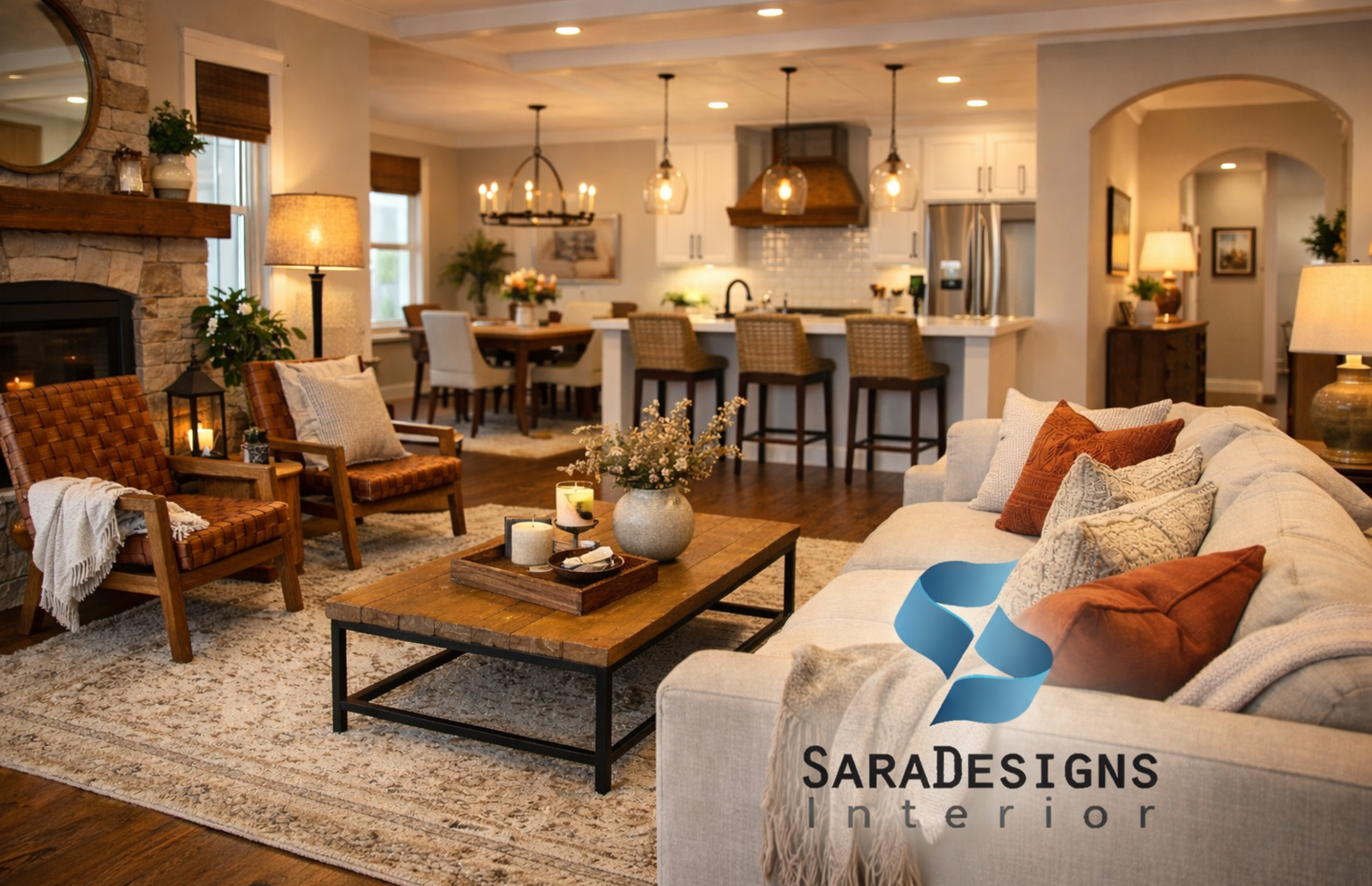
2. Blush Pink – Gentle Warmth for Social Spaces
Soft and sophisticated, blush pink is a modern neutral that adds subtle charm without being loud. It complements a wide range of materials and tones, making it versatile and inviting.
Style it with:
Rattan or light oak furniture
Warm metallics like gold or brass
Pale neutral upholstery
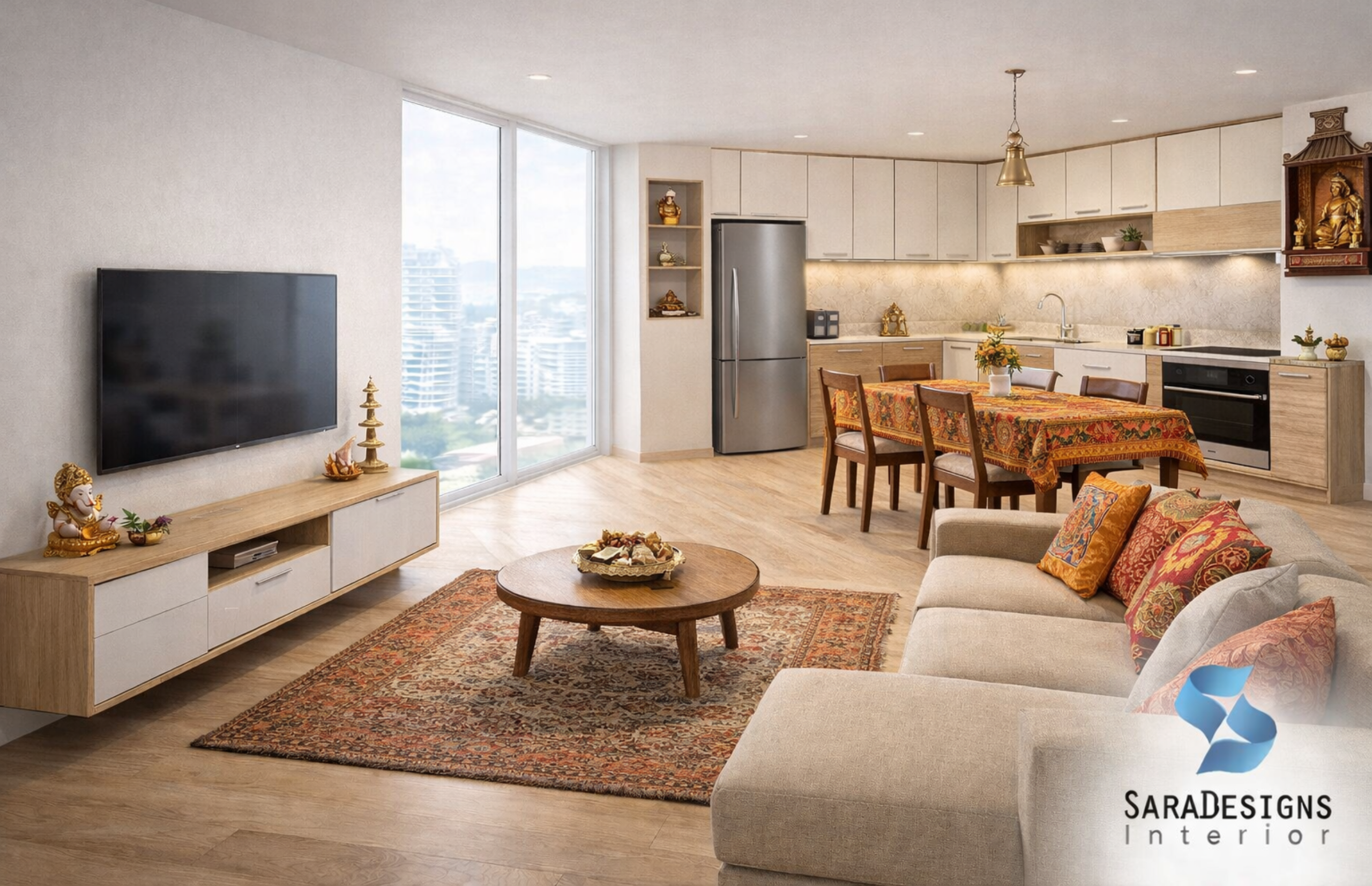
Ideal for: Living rooms, entryways, and dining areas.
3. Sky Blue – A Breath of Fresh Air
For a light, airy feel, sky blue is a top choice. It creates a serene backdrop and evokes a breezy charm, helping your mind and home feel refreshed.
Pair it with:
Crisp whites for contrast
Soft grey or wood elements
Transparent curtains and subtle lighting
Ideal for: Bathrooms, compact living rooms, or reading corners.
4. Muted Lavender – Elegance with Tranquility
Muted lavender is a graceful shade that balances richness and restraint. It adds depth without overwhelming, making your space feel indulgent yet serene.
Style it with:
Velvet upholstery or suede finishes
Brushed gold decor
Warm whites and soft greys
Ideal for: Master bedrooms, powder rooms, and stylish guest rooms.
5. Mauve and Soft Grey – A Balanced Duo
Combining mauve with soft grey offers sophistication with calm. This pairing delivers a gentle contrast that’s subtle and soothing.
Use it with:
Pale wood or off-white flooring
Layered throws and cushions
Simple metallic touches
Ideal for: Modern studios, contemporary bedrooms, or minimalist lounges.
Common Mistakes to Avoid When Using Soothing Colours
While working with soothing colours for home interiors, here are a few things to keep in mind:
Overusing one colour: Add variation by layering soft shades across different elements.
Ignoring natural and artificial light: Always test swatches under both.
Too much contrast: Avoid jarring differences that break the flow.
Skipping wall samples: A paint chip can be deceiving—always try a patch first.
Following trends blindly: What’s trendy isn’t always what’s tranquil. Trust your instincts and consult a professional Interior designer in Gurgaon.
Create Your Calm with Sara Designs Interior
Every colour you choose helps shape the way your home feels. With soothing colours for home interiors, you create a space that welcomes peace, invites calm, and supports better living.
Our team at Sara Designs Interior, a trusted Interior designer in Gurgaon, specializes in crafting homes that reflect your taste and bring emotional comfort. From planning colour palettes to styling each room, we’re here to make your tranquil home dream a reality.
Book your FREE consultation today and enjoy up to 25% OFF on customized interiors!
FAQ
Q1. What are soothing colours in interior design? Soothing colours are soft, muted shades like sage green, blush pink, sky blue, and warm greys. They promote calmness and relaxation at home.
Q2. Which are the best colours for a calming bedroom? Sage green, lavender, blush pink, and soft grey are ideal for restful, sleep-friendly bedrooms.
Q3. Can I mix soothing colours in one room? Yes! Layering colours like beige, sage, and pastel tones adds depth without losing the calm effect.
Q4. Do lighting conditions affect how soothing colours look? Absolutely. Natural light brightens soft tones, while warm lighting can make them feel even more inviting. Always test colours in the actual space before finalizing.


